line charts
|
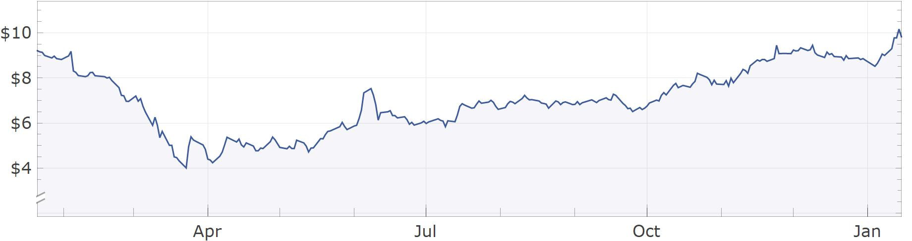
A line chart is the simplest way to visualize price movement for a stock. This type of chart is often displayed when searching up a stock price or when the price of a stock is displayed on the news. It is very simple to understand since it just displays a line connecting the prices of the stock at set times throughout the day/week/month/year/etc. An example of a stock line chart is below. This example shows the stock price of Ford Motors between 2020 and 2021. Looking at the chart you can see that it had a 52 week low of around $4 and a 52 week high of around $10. It is also apparent that the stock was bearish early in 2020 until around April and has been bullish between April 2020 and January 2021.
|
|
|
|
Candlestick charts |
|
|
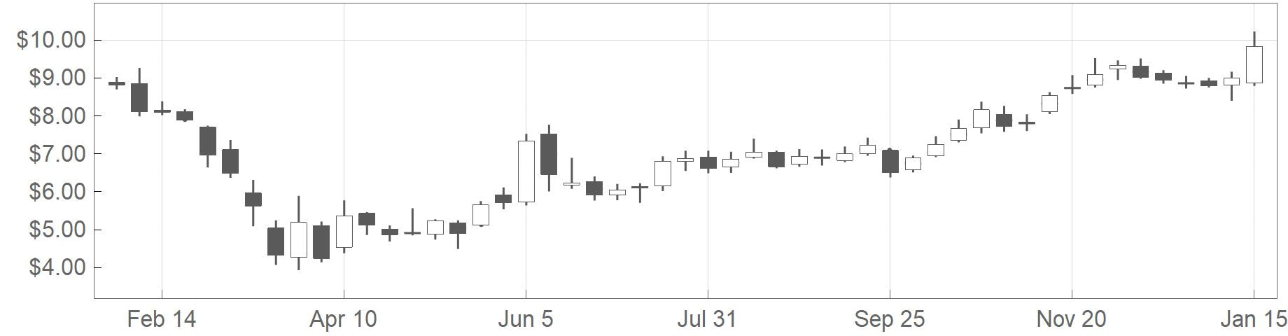
A candlestick chart is a bit more complex and also shows the viewer more information. A candlestick chart consists of bars that look like candlesticks, thus the name candlestick chart. Each bar shows 5 pieces of information. The open, high, low, close, and direction of the stock movement. The direction is shown by the color of the candlestick. Generally, the color patters are either black/white or green/red. For the black/white color method, white generally means an upward movement and black means a downward movement. For the green/red, green is up and red is down. If a candlestick shows upward movement, then the bottom of the fat part of the candlestick shows the opening price and the top of the fat part of the candlestick shows the closing price. The highest point, which is like the wick of the candlestick, is the highest price in the timeframe of the candlestick. The lowest point, which is like a wick at the bottom of the candlestick, is the lowest price in the timeframe of the candlestick. This chart below shows the same stock in the same timeframe as the chart above. All the same information can be seen from above, but also included is the more specific information about daily high, lows, open, and closing prices for each trading day.
|
|
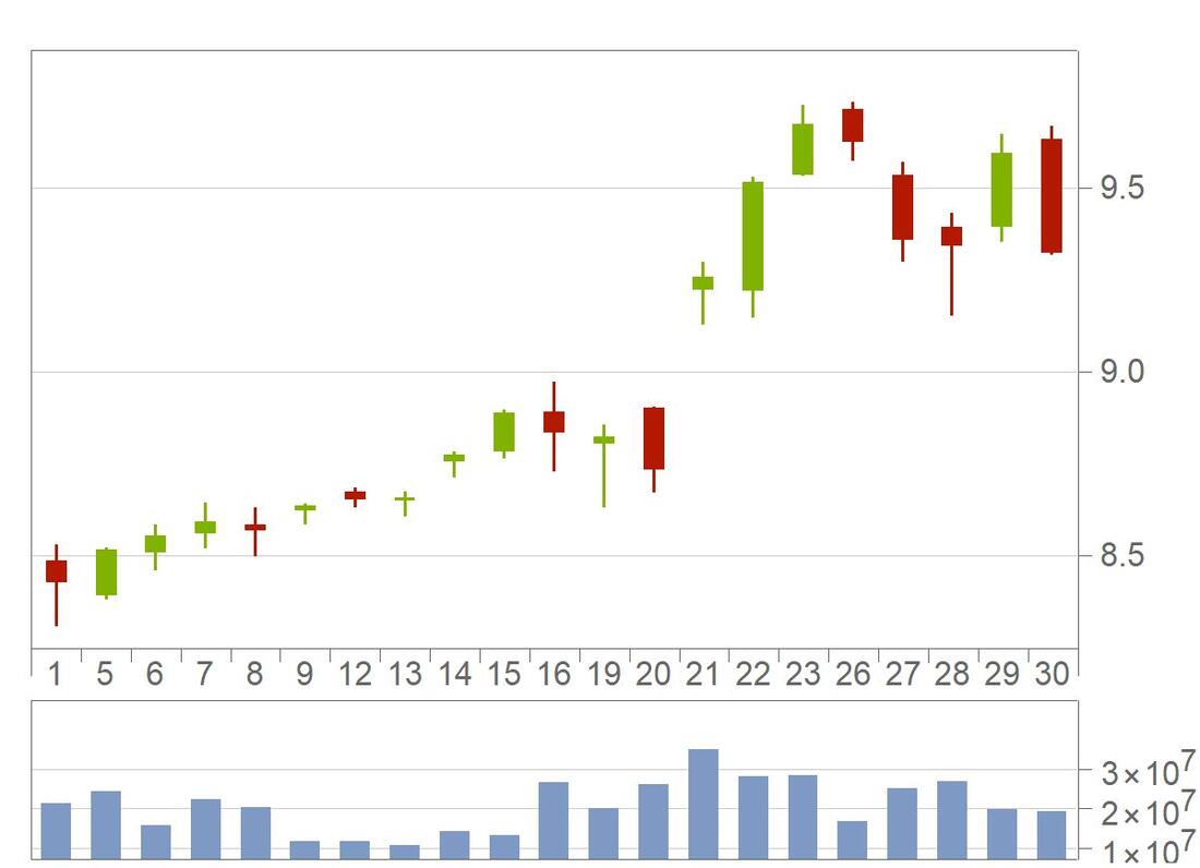
Below is a very simple example of a candlestick chart. Each candlestick represents a month of data for an imaginary stock. In October, we can see the candlestick is green, which shows the stock price is moving upward in that timeframe. As well, the opening price that month was around $10.52, the closing price was around $10.75, the high around $11.22, and the low around $10.30. The candlestick in November shows a downward movement since it is red. The opening price was around $10.56, the closing price around $10.34, the high around $10.88, and the low around $9.98.

Volume chart
Another bit of key information is the volume traded during a set time period. Below is an example of a candlestick chart with the volume of each trading day shown in the chart below. The volume on a given trading day allows the viewer to see how active a stock was trading in a set timeframe. If a stock has a relatively higher volume on a given day, it can suggest that something important occurred that day such as a news story. Below you can see that the largest volume occurred on day 21 with a volume exceeding 30 million. This also aligns with a large price jump between day 20 and 21, so it can be inferred that a positive news story, such as great earnings, was released that day.
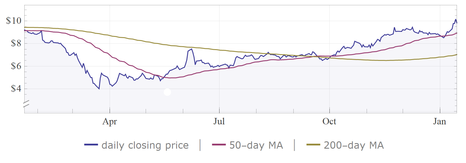
Moving Average
Moving average is a metric which averages the past trading days, often the past 50 or 200 days, and is plotted alongside the stock line chart. The moving average can help determine the extent that a recent price is similar to the previous trading days. If a stock is significantly higher or lower than a moving average it could suggest volatility or a recent change that is causing price fluctuations. As well, it could potentially suggest weakness in the current price, such that it may begin moving back towards the moving average line. The chart below shows both a 200 and a 50 day moving average line. You can see that the moving average lines are very smooth compared to the daily closing line. This is a result of the averaging, which makes the line very resistant to sharp movements. The longer the time period the average is calculated over, the more resistant the moving average line will be to rapid daily fluctuations. The moving average could be a way to visualize the trends in a stock since it filters out some of the daily volatility. A smooth up or downward moving moving average could show support of an up or downtrend.